I’m putting together a tool kit for analyzing a narrow slice of the 2018 general election results.
I want to see look at two kinds of county-by-county patterns. First, what’s the relative strength of Republican and Democratic candidates in statewide races in 2018?
Second, how does the strength of statewide candidates in 2018 stack up against the relative strength of Donald Trump and Hilary Clinton in the 2016 presidential election?
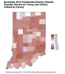
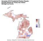
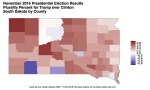
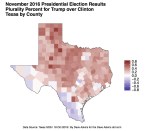
I’ve assembled the geographic information and 2016 election results for four states where I’ve lived (Indiana, Michigan, South Dakota, and Texas) and another one (North Dakota) which I know as an inferior version of a state where I have lived, but only because I have not lived there, I’m sure. I kid the North Dakotans.
I’ve built choropleth maps for the 2016 presidential election. Once the 2018 election results are in, I’ll build similar maps for 2018 statewide races, and maps to analyze the difference between the two. Here’s what the maps for the 2017 presidential race look like: